


Image Credit: Takeitapp.co
Mobile UIs have radically altered the way in which users are engaging with digital interfaces. Gestural controls are slowly replacing mouse clicks, a premium is placed on screen real estate, and skeuomorphism has all but gone the way of the caribou. In place of former 3D realism stands the Flat design revolution in all its two dimensional glory.
Well, sort of.
These days, Flat 2.0 is mixing up the game a bit. Flat was originally, unswervingly, well… flat. There were few obscurities, very little contrast, and a clear emphasis on minimalism. These days more color, shadows, and other on-page elements are in full effect.
Even so, Flat 2.0 doesn’t fall far from the original flat tree. It still has some distinct commonalities with the original design guidelines. Even Google’s Material design Flat-inspired evolution maintains a strong connection with the traditional Flat aesthetics.
Today, we’ll look at 5 unyielding pillars of Flat design. We’ll be examining their usage and pointing out some of the more vibrant examples thereof.
Let’s get started.
1. Minimalism
The first and most enduring item on our list is minimalism. Flat and minimalist aesthetics are virtually inseparable. Minimalism serves to isolate the important elements on the page, such as imagery, copy, Calls to Action, navigation controls, and so on. The item’s importance is then highlighted due to the exclusion of virtually everything else.
Observe these examples of Flat minimalism:
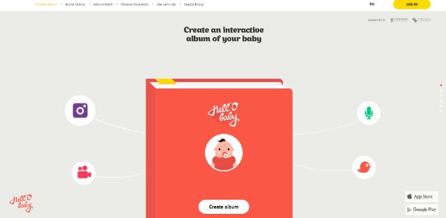
Image Credit: Hell-o-Baby.com
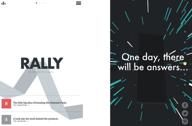
Image Credit: Rally Interactive Image Credit: Soleilnoir.net
Each of these websites has a unique and singular focus. The negative space surrounding clickable elements creates a palpable feeling of deviation. In other words, staring off into space on these websites convinces you that you’re looking in the wrong direction.
It’s artfully done. The placement of links, buttons, images, and animations must be well balanced in order for the sites not to feel clunky and unharmonious. One would think that minimalism would be easier to design, but when your content has to stand out on its own merits, it can actually be rather difficult to design a mostly empty page in such a way that pleases the eye.
That’s because the visual hierarchy isn’t immediately visible. You have to rely on a user’s familiarity with interfaces, as well as the distinctiveness of each content box.
Minimalism in great for certain projects, but our agency has found minimalist design (and thereby minimal text) to be less than optimal for SEO.
2. Lively Color Choices
One thing that Flat designs never lack is an interesting color palate. Because the visual effects can be few and far between (re: minimalism) brightly colored backgrounds and elements are a necessity for the vast majority of Flat designs.
High energy colors create some much needed contrast in order to create a sense of visual diversity within the design. This keeps a page with little else going on from appearing boring. It also invigorates viewers, keeping them engaged and excited to interact.
Take a look at some of these colorful examples:
![]()
Image Credit: History of Icons
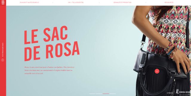
Image Credit: DansMonSac.ca
Image Credit: CFYE.com
Trippy colors and stark black on white text work together to create dynamic bits of contrast that feel both exciting and soothing to the eye, simultaneously.
3. Typography That Doesn’t Put On Airs
In keeping with the theme of simplicity, Flat puts an emphasis on bold, easy-to-read typography. This same thing can, of course, be attributed to many different styles of design. Readability is essential for all websites, so “no-frills” fonts are often a universal imperative.
Flat, however, has brought this truth to the fore. Because Flat is so popular, negative space so abundant, and color so often used to highlight on-page elements, this means that the typography on a page is frequently the star of the show.
Flat typography is often set in extremes. Either very large or very small sans serif text with uniform width can be laid over images, video, or negative space—and the effect is mesmerizing:
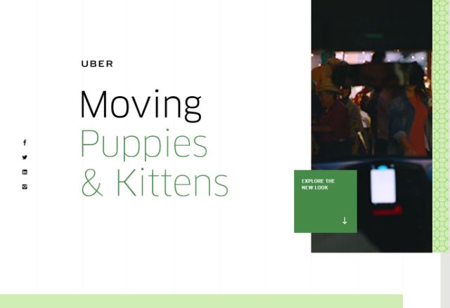
Image Credit: Uber
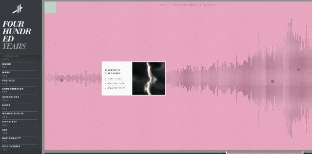
Image credit: Histography.io

Image Credit: Endeavor Capital
4. The Absence of Light
With such bright colors and white space being prominent features, the fact that shadows are also a big part of the Flat aesthetic might catch some by surprise. Nevertheless, shadows are responsible for that vaunted third dimension we talked about earlier.
Granted this is a newer development in the Flat field, but now it’s become virtually indispensable. Giving depth to the digital landscape makes all of the on-page elements you want to emphasize pop out to the user. It also allows for interesting animation opportunities as you can tell from the examples below.
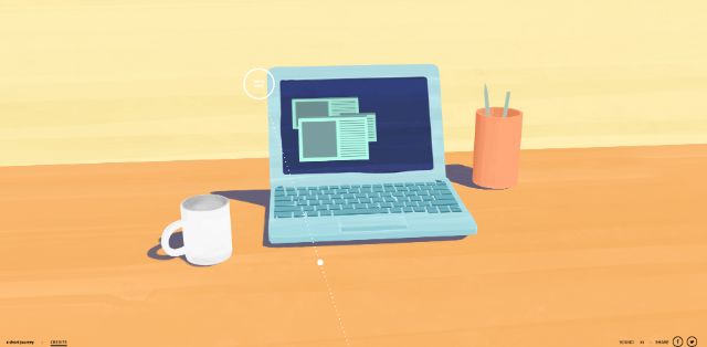
Image Credit: Ashortjourney.com
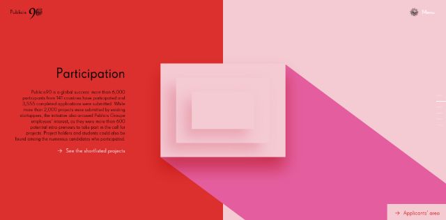
Image Credit: Publicis90.com
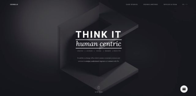
Image Credit: Exo-Skills.com
Though they are often referred to as “long shadows,” as you can tell, the shadows themselves can be longer or shorter depending on the level of subtlety required by the content.
5 . Transparent Buttons
The final item on our list can be a bit hard to see. Literally. Transparent or “ghost” buttons are a widely adopted trend that is closely associated with Flat design, but they aren’t necessarily attached to it. The buttons look great. They draw just the right amount of attention without hogging the spotlight and they don’t distract users from a webpage’s primary content.
Moreover, ghost buttons are supremely versatile. Regardless of vibrant color scheme, negative space, or an abundance of text, a clear button surreptitiously placed just within a user’s line of sight is going to blend in just fine.
Image Credit: DrawBetter2016.com
Image Credit: Apart-Collective

Image Credit: DaniellaDraper.com
That’s all for our unfailing facets of Flat. There are other trademark signs of a Flat design, but these are the points that make a website look bonafide.
What are your favorite features of Flat? Sound off in the comments!
Good tips. Thanks! It’s seems to be insignificant, but when you consider all details, they are all important to the overall result.