
The farther we travel into the digital age, the clearer it becomes that mobile computing is the single most disruptive technology to the paradigm of the 20th century. With the sum of all human knowledge at our fingertips—wherever we go—it’s impossible not to feel at least a little overwhelmed, on occasion.
That’s why the design and implementation of mobile user interfaces is such an important field of study. The way in which we interact with these mobile devices defines the way we see and interact with the world at large. New technologies like augmented reality are only increasing the evidence that mobile UI will define our interactions with the world, moving forward.
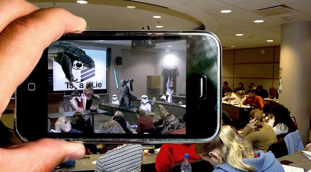
Image Credit: Flickr
Since this is the case, it’s incumbent upon the design community to stay abreast of the latest trends and techniques being used to create usable, intuitive interfaces that will be equally accessible to a diverse and numerous group of users. Furthermore, it’s helpful for SEOs to do the same in order to keep on the sunnier side of Google’s Mobile-Friendly test.
Luckily, the trends we’ve used for mobile UI are starting to become more defined and a clear path forward is emerging. Today we’ll take a look at some of the more popular controls, features, and aesthetics with which every mobile UI designer should familiarize themselves.
Forget Gestures and Start Swiping

Image Credit: College Humor
Gesture controls started really coming to the fore in 2007 with Apple’s Pinch and Zoom. Small screens necessitate the ability to zoom in so this appeared quite useful—at first. As it turns out the younger generation is more familiar with the way touch screens work and find it very intuitive to interact with mobiles of all types. While older users don’t find it so obvious that double tapping will increase size or access different content types.
The current conventional wisdom says that you should work toward minimizing gestural controls since they don’t translate across demographics as seamlessly as one might hope. There are however some transcendently intuitive gestures such as the drag to refresh technique, and swiping, in particular.
For card style application and website designs, swiping is nigh universal. A simple slip of the finger to the left or right and the content responds. Mass media campaigns for products like Tinder have made this gesture part of the common vernacular for the youth, while the innate intuitiveness of the motion make it more accessible for the elderly.
Flat Simplicity
This is hardly a surprise but a flat design is well suited to a smaller screen. Flat, Flat 2.0 and Material design were all developed with mobile UI in mind. Further, they were created to be responsive, scalable solutions. This is achieved through several areas of emphasis that the three design styles share:
- Minimalism
- Typography
- Color scheme
The minimalist aesthetic of the three flat variants allows for uncluttered, single-use, and focused UIs. While typography of the flat universe tends to be bold, equal in stroke length and inexorably readable. Finally the vibrant color schemes so often used in flat design and its off chutes make for relaxing browsing experiences which easily and freely flow from one element to the next.
The commonalities of Flat interfaces are well documented, and much praised. The color schemes contrast well enough to lead or divert user attention toward the designers intended focus, while ensuring that any buttons on the page stand out even more. The buttons themselves benefit from the minimalist focus due to there being fewer on page elements, and allowing for more real estate being devoted to obvious CTAs.
Take this screenshot from AirBnB for example:

Image Credit: AirBnb
AirBnB might be the perfect example of well implemented flat minimalism. Let’s count it off:
- Negative space devoted to property imagery
- warm colors contrasting with white space to attract user attention to the CTA
- 6 clickable elements are visible above the fold (navigation at the top, CTA at the bottom, and deeper content information in between
- Ghost buttons which respond with color changes as feedback
Everything about this interface screams engagement and usability. There’s no wasted space and the aesthetic is phenomenal. I would, however, see about cutting a few of those trees down. In close proximity to the house like that it ruins curb appeal and you’re just bound to have a branch fall on your roof at some point…
Clever and Cautious Animation
Animation has been a somewhat divisive subject for mobile UI in the past. When poorly implemented it’s often clunky and unattractive. More to the point, it makes a website slower. Therefore it’s been largely avoided up till this point.
Advances in CSS, HTML5, and other design techniques are altering this paradigm. It can be used to highlight navigation, offer feedback in a microinteraction, or as is the case with parallax scrolling: offer an element of depth to your (usually flat) designs.
Image Credit: Dribbble
It is however worth noting, that it’s still easy to overdue animations. You need to be careful not to implement an animated effect just for the pomp and circumstance. Rather, be certain that all your animations serve a purpose. Either to point something out to the user or to complement another part of the user experience.
Fast Navigation Access
Navigation is an ever-present concern in web design. Users need to have fast and usable access to their preferred destinations within your site or app. Moreover, the friction between points “a” and “b” has to be kept to a minimum. Specifically, the most important pieces of content should never be more than a tap or two away.
But this presents a problem when you’re looking to keep the interface clean. One common method of addressing this dilemma is the hidden navigation control, the hamburger navicon:
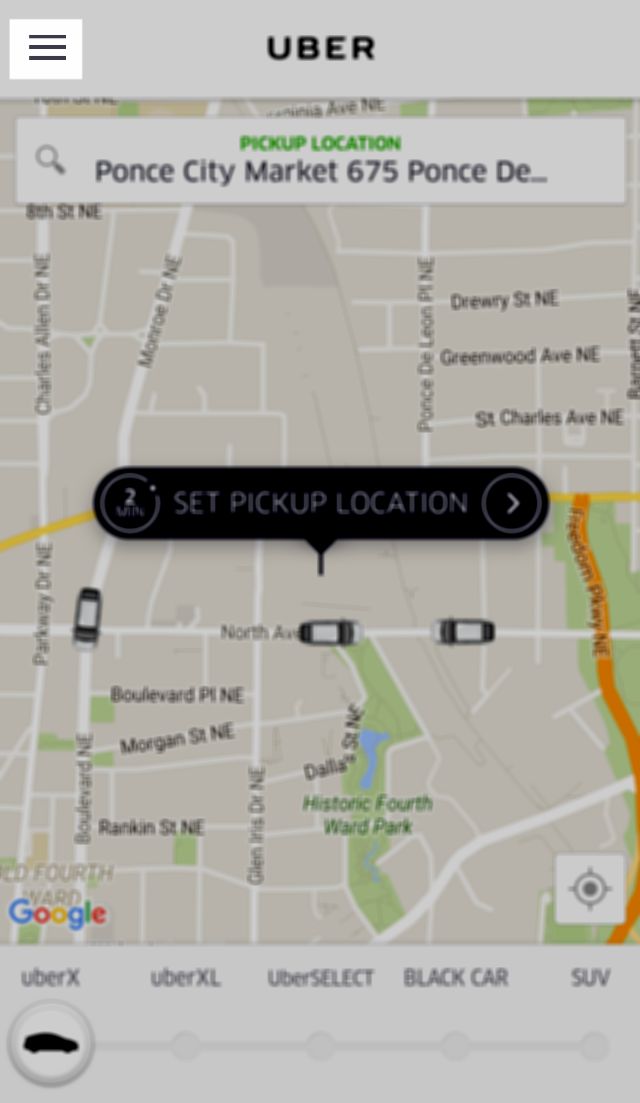
Image Credit: Uber
This inauspicious little button serves to keep all your most browsed destinations close at hand regardless of where you happen to be on the page. It also serves the purpose of highlighting navigation options only when the user chooses to prioritize them. It’s far from the only solution but it is one of the most elegant.
Sparing and Proper Use of Overlays
I think it’s pretty clear to anyone who spends any time browsing that popups really do suck… but sometimes they’re necessary. The problem is knowing when and where to use them. On a news site as soon as you start reading an article? You do that and I might just navigate away out of sheer frustration. After I’ve finished reading the content? Well, now I’m not in the middle of anything, if your offer pertains to my interests, I might be more amenable.
That’s the real trick to content overlays, you have to ensure that they are only as intrusive as they have to be. And it’s helpful if they don’t come up while I’m in the middle of a task, unless the overlay supplements the content I’m already consuming. They should only come up when a moment of focused interaction is required. Like a login box at the beginning of a browsing session, for example. Or a loading message such as the one seen here:
Image credit: Dropbox
User Centered Design:
The final trend that should be at the top of every designer’s list for mobile and beyond is user-centered design. Mobile first was the buzzword for a long time, referring to the importance of making responsive websites that could be scaled up from mobile to desktop screens. The logic there, however, is flawed.
Mobile is just a part of the grander scheme of methods that users take advantage of when interacting with your designs. It’s just one context in which engagement occurs, and therefore shouldn’t be a priority. Rather, the users themselves need to be the center of all you do as a designer.
First, determine product goals, and see how they align with those of the user. Use your mobile UI to highlight this alignment, to streamline it and put it at the forefront of user attention. Doing this is the surest way to success.
What other mobile trends have caught your eye in the recent past? Share your observations in the comments.